
Login Page Redesign
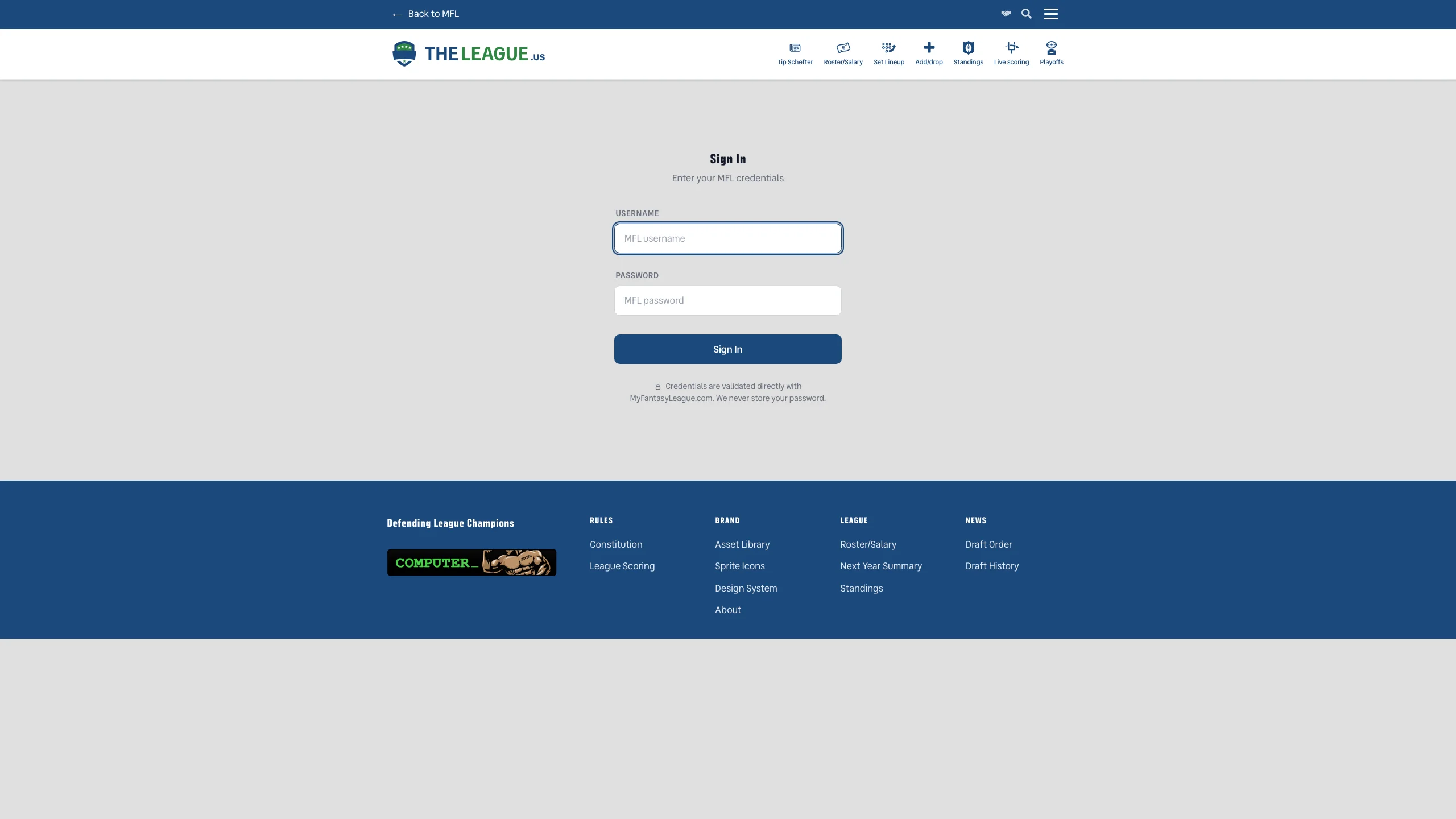
The sign-in page got the editorial treatment — clean labels, proper spacing, and a form that finally looks like it belongs on this site.
The Full Story
The old login page had all the visual personality of a hospital check-in kiosk. Two input fields, a button, and the quiet implication that design was somebody else's problem. It worked, technically, the same way a folding chair works at a dinner party — functional, sure, but nobody's impressed.
The new sign-in page follows the same editorial design language as the rest of the site: uppercase micro-labels, considered spacing, a CTA button that actually looks like it wants to be clicked, and a security note that gently reminds you we never store your password. The form is also built as a reusable component now — meaning it can drop into a modal on any page without a single line of duplicate code. Accessibility got the full treatment too: proper focus rings, ARIA error announcements, and keyboard navigation that doesn't fight you.
It's a login page. It shouldn't need a press release. But it also shouldn't look like it was built during a lunch break in 2009.
Message