
Editorial Design System
The living reference for our typography, layout, and component patterns. Every section below shows a real pattern from the codebase — not abstract swatches.
Typography
Type Scale
Section Titles
Left-Border Accent (Signature Pattern)
The most recognizable editorial element. Used for every content section heading across all pages.
Contract Details
Season Results
Roster Breakdown
font-size: var(--font-size-xs); font-weight: 700; text-transform: uppercase; letter-spacing: 0.06em; border-left: 2px solid var(--color-primary); Hero Banner
variant="editorial" — no image prop 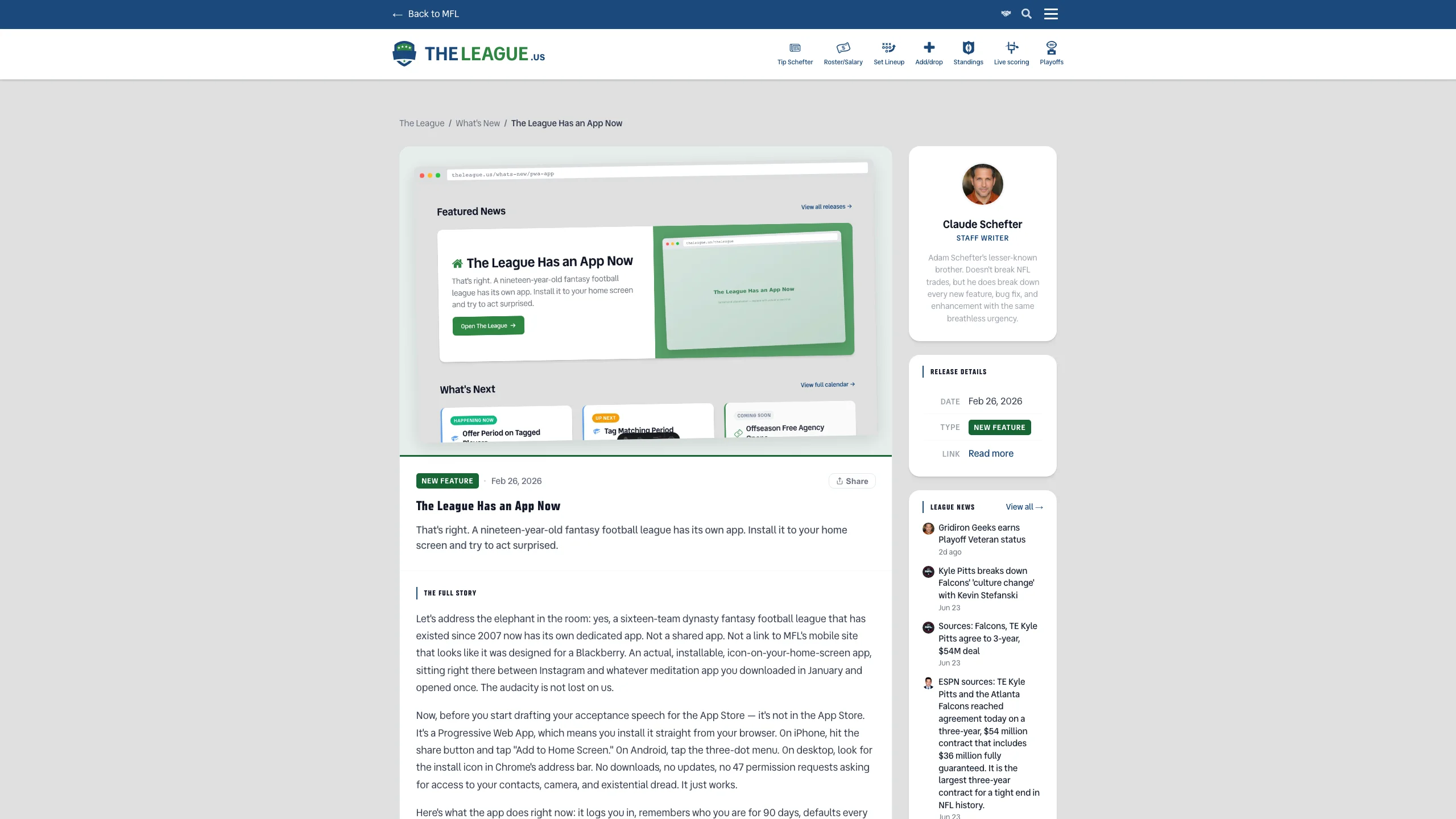
variant="editorial" image="screenshot.webp" imageAlt="..." Key Metrics
3-Column Metrics Grid
Hero-level stats in a tight grid. Large tabular-nums values with micro uppercase labels.
Variant: 4-Column
Detail Rows
Label + Value Flex Rows
Fixed-width right-aligned uppercase labels with flexible values. Separated by subtle gray-50 borders. Not a table — flexbox.
Player Details
Contract
Badges & Pills
Status Indicators
Pills (Neutral)
Semantic Badges
Type Badges
Contract Status Designations
Compact chips displayed inline with salary & years. RC and TO are persistent — they follow a player across seasons. F is a decision result applied by the owner and resets each season.
In Context
Player Lockup
Default Size (40px avatar)
The standard player display. Circular headshot, bold name, NFL logo + position meta row. Uses PlayerCell.astro.







Compact Size (32px avatar)
For denser layouts like tables. Same pattern, smaller scale.
DEF Handling (Auto)
Team defenses automatically swap the headshot for the NFL team logo. No special caller logic needed.

Tables
Editorial Table
Sticky uppercase headers, hover rows, tabular-nums, and color-coded values. Player lockups in the first column.
| Player | Pos | Salary | Pts/G | Yrs | Status |
|---|---|---|---|---|---|
| Patrick Mahomes | QB | $5,082,000 | 24.3 | 3 | S |
| Ja'Marr Chase | WR | $3,850,000 | 19.7 | 2 | S |
| Justin Jefferson | WR | $4,100,000 | 18.1 | 4 | S |
| Travis Kelce | TE | $2,200,000 | 12.4 | 1 | Q |
| Christian McCaffrey | RB | $3,600,000 | 0.0 | 2 | IR |
| Total (5 players) | $18,832,000 | 14.9 | |||
Interactive States
Selection Pattern
Interactive cards/options use left-border accent + subtle gradient to indicate selection.
Color Palette
Text Hierarchy
Brand & Semantic
Surfaces & Borders
Shadows
Elevation Scale
Layered shadows with blue-tinted color. Each level doubles offset/blur for realistic depth.
Spacing Scale
Spacing Tokens
Border Radius
Radius Tokens
Buttons & CTAs
Every call-to-action on the site is one shared pattern, defined once in src/styles/cta.css and loaded by every layout. Three shapes: cta cta--primary, cta cta--ghost and cta-link. They work identically on <button> (in-page actions: submit, open a modal, run script) and <a> (anything that navigates). Never hand-roll a __cta / __btn look — add the shared class and keep your own BEM class only for layout (padding, width, margin). tests/cta-pattern.test.ts fails on a CTA-shaped link without it.
Primary — cta cta--primary
The standard filled CTA for page-level actions, forms and modals.
<a class="cta cta--primary" href="…">Change your vote</a> --cta-bg → var(--btn-primary-bg) --cta-bg-hover → var(--btn-primary-bg-hover), translateY(-1px) --cta-ink → var(--btn-primary-text) — never changes, never underlined padding 0.625rem 1.25rem · var(--radius-md) · var(--font-size-sm) · bold :disabled or aria-disabled="true" → opacity 0.45, no hover Ghost — cta cta--ghost
Outlined, transparent ground, link-coloured ink. The secondary action sitting beside a primary: "Back", "Cancel", "Maybe later".
Arrow link — cta-link
A text link that goes somewhere: "see more", cross-links between pages. The CSS draws the trailing arrow, so the label never types its own › or →.
Hover Convention
background steps to its hover token + 1px lift; text colour never changes, never underlines ink steps to the link-hover token, the arrow nudges right, no underline the state rules sit at (0,2,0) and beat every layout's global a:hover (red + underline) Customising — the --cta-* variables
The base rules carry zero specificity, so your own class wins for layout. Colours are custom properties — set them on your class, never background / color directly (the hover rule reads the variables and would replace a hard-coded background). Filled and ghost: --cta-bg, --cta-bg-hover, --cta-ink, --cta-ink-hover, --cta-border, --cta-border-hover, --cta-focus-ring. Arrow link: --cta-link-ink, --cta-link-ink-hover.
Example — the green affirmative CTA ("Submit Bid"), reserved for actions where green signals "go". Not a general-purpose CTA; default to primary.
style="--cta-bg: var(--btn-secondary-bg); --cta-bg-hover: var(--btn-secondary-bg-hover); --cta-ink: var(--btn-secondary-text); --cta-border: var(--btn-secondary-bg)" .hero__cta { --cta-bg: #fff; --cta-bg-hover: color-mix(in srgb, #fff 88%, black); --cta-ink: var(--league-accent); --cta-border: #fff; } Composite Example
Player Profile Card
A realistic composition showing how all editorial patterns combine into a cohesive layout.
Kansas City · QB · #15
Details
Contract
Animation & Motion
Slide Animations
Entrance animations for modals, panels, sidebars, and floating UI. All use ease-out timing for smooth deceleration and forwards fill-mode to hold the end state.
@keyframes cardEnter {
  from { opacity: 0; transform: scale(0.96) translateY(12px); }
  to   { opacity: 1; transform: scale(1) translateY(0); }
}translateY(100%) to resting position. @keyframes slideUp {
from { transform: translateY(100%); }
to { transform: translateY(0); }
}@keyframes panelIn {
from { opacity: 0; transform: translateX(16px); }
to { opacity: 1; transform: translateX(0); }
}@keyframes triggerEnter {
from { transform: translateX(100%); opacity: 0; }
to { transform: translateX(0); opacity: 1; }
}Motion Guidelines
ease-out for entrances — elements decelerate into place forwards when the element starts hidden (opacity:0) 0.3s cubic-bezier(0.4, 0, 0.2, 1) for interactive state changes (hover, focus) Empty & Error States
Empty state
EmptyState.astro (React: states-react.tsx; scripts: buildEmptyStateHTML).
Say what is missing, why that is fine or when it fills, and offer the next step. Action labels are verb + object.
Error state
ErrorState.astro. Only for "we could not read it" — never for a well-formed empty answer.
Say what failed, that the data is missing rather than zero, and how to recover.
Couldn’t load the standings
MyFantasyLeague didn’t answer. These are missing, not zero — trying again usually works.
Compact
Inside a card or a table cell, pass compact: no dashed panel (no card within a card), left-aligned with its neighbours.
No MVP votes yet.
Couldn’t load this week’s scores.
Loading States
The Duration Ladder
Loading indicators are chosen by how long the user actually waits, not by page.
The full contract lives in docs/claude/loading-standards.md; the shared
primitives are src/components/shared/loading/* +
src/styles/loading.css, with string builders in
src/utils/loading-html.ts and the React hook
useLoadingState() driving tier escalation via
resolveLoadingTier().
Spinner (tier 2/3)
Accent from var(--league-accent) — skins per league with no code branch. Sizes: compact / default / large.
Button Loading (tier 3)
Add loading-btn + is-loading to a button: spinner replaces the label and the button disables — double-submit prevention comes free. Use loading-btn--on-accent on solid accent fills.
Skeleton (tier 4)
Gray shimmer blocks mirroring the final layout. Brand-neutral by design. Variants: title / text / block / circle; count renders a stacked list.
Thinking Dots (tier 5, AI)
Extracted from the Schefter typing indicator. For AI waits under the branded threshold.
Roger is checking the constitutionBranded Moment (tier 5, 10s+)
The one tier that carries league character. Narration cycles via aria-label updates; reduced-motion collapses the pulse to a static ring. Fires only above the 10s threshold — never on routine loads.
Roger is deep in the constitution
Flipping to the relevant bylaws…
Rules
loading.css --league-accent, fills are --color-gray-100/200 role="status" + aria-busy + polite live region on every surface; button spinners add disabled
Message